Login / Register
Login
New Customer? Start Here
Home » The Color Edit: Winter 2025’s Hottest Hues

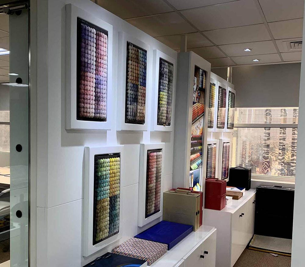
Winter 2025 interior color with some seasons arrive quietly; Winter 2025 glides in wrapped in tones so indulgent, they feel like a little luxury you gift your home. The kind of shades that don’t fight for attention but naturally command it, like a well-cut coat or the perfect pair of boots. At ARS Colors, we’ve spent months surrounded by yarns, pigments, pom sets, and the most tempting box of colors you can imagine, studying what will define the winter aesthetic for décor lovers, rug collectors, and anyone who obsesses over interiors the way some obsess over perfumes.
This year’s palette has a personality. It has moods. It has stories. And most importantly, it
has range.
The nostalgia wave is still rolling, but Winter 2025 interior color has refined it. Modern retro color trends aren’t dipping into clichés, they’re playing with earthy warmth, softened glamour, and that irresistible vintage patina. Olive softened with smoke. Hues of caramel paired with dusty lilac. Clay melting into blush the effect? Effortlessly chic. Picture a living room grounded by a deep sienna carpet from the arsin rug gallery, or soft lavender cushions resting against tobacco-toned upholstery. These aren’t mismatched experiments, they’re deliberate contrasts, made harmonious through precise color match work rooted in our ARS collection.
There’s something undeniably comforting about wool in winter, and designers are leaning into it. This year, the question ‘what color is wool?’ has a wonderfully romantic answer: it’s the shade of warmth. Beige, oat, sand, mushroom, mink, tones that feel like cashmere in color form. These wool colors give a room subtle presence. A quiet luxury. The kind of beauty that doesn’t try too hard.
And if you’ve ever wondered how these tones stay so perfectly consistent across rugs, throws, and statement carpets… it’s the magic of ARS Colors and our textile-focused color reference system. Whether it’s hand-knotted wool or plush modern blends, precision keeps everything looking intentional and elevated.
Winter usually leans neutral, but this year, bold tones are having their renaissance, polished, grown-up, confident. Think gemstone shades: garnet, amber, deep sapphire, forest emerald. But instead of overpowering the room, they punctuate it.
This is where ARS Colors works behind the scenes. Jewel tones only stay luxe, not chaotic, when the color palette supporting them is mastered thoughtfully. Coordinating a sapphire rug with smoked cedar walls or pairing deep rust with warm brass becomes effortless with reliable ARS products guiding your tones.
Designers are embracing this bold softness like never before. Drama, but make it tasteful.
Winter 2025 décor is having a cinematic moment. Homes are leaning textured, layered, and visually warm. Colors aren’t accessories anymore, they’re the atmosphere. Imagine this, a monochrome bedroom in almond, latte, and soft cocoa, a moody corner wrapped in charcoal wool with amber metallics, or a living room glowing under smoked gold lamps while a hand tufted rug in deep plum anchors the space. Every look feels intentional because the foundation, color, is curated with care.
And that’s where the ARS Colors comes in, blending artistry and science to create palettes that feel both fresh and timeless. Not in a loud or showy way, but with the confidence that
comes from knowing every colour inside and out. ARS combines their artistic sense with
exact colour science to create palettes that are both on-trend and classic, expressive and
well-balanced. Not only do their colours fill a room, but they also set the mood, tell a story,
and finish off the design.
At its core, Winter 2025 is a love letter to warmth. And not just physical warmth; the kind of mental warmth that can only be made by carefully chosen color. This year’s color range encourages you to create with purpose, enjoy the quiet drama of deep tones and tactile neutrals, and play with vintage styles.
And as always, we at ARS Colors are here, behind the pigments, in the wool, inside the rugs, crafting the hues that let your home feel dressed for its most beautiful season yet.
Choosing us isn’t just about picking a shade for your dream project whether it’s your home, workspace or just the overall theme of a space, it’s about choosing confidence. In a world where one dyeing slip can shift an entire production run, ARS becomes the quiet hero behind flawless design. Our color reference system takes the guessing out of it, turning your gut feelings into accurate information and your imagination into consistency. Whether you’re working with wool colors, experimenting with a new color pallet, or trying to achieve a perfect color match, ARS gives you the reassurance that what you envision is exactly what you’ll create. Designers trust us because we don’t just offer swatches, we offer clarity, control, and a palette of possibilities that feels effortlessly future-ready.
RECENT POSTS
OUR INSTAGRAM