The 5 Hottest ARS Shades that are dominating living rooms in 2025
You know that feeling when a room just gets it right? Like walking into a space and instantly sensing the vibe was carefully calibrated by someone who’s been reading your design mood board in their dreams? That magic? Nine times out of ten, it comes down to one thing: color. And this year, it’s safe to say that living rooms across the globe are having their main character moment, drenched in shades that are bold, elegant, and unapologetically specific.
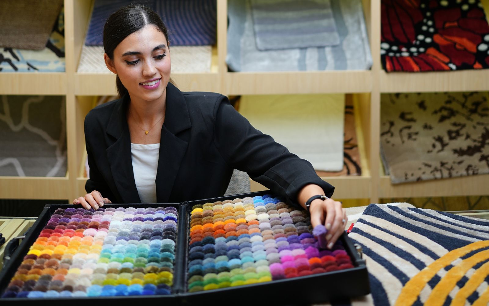
At ARS Colors, we live for this moment. The moment a shade shifts a space from nice to need-to-know-who-designed-this. As a color referencing tool used to minimise dyeing errors, we’ve always believed that the perfect hue isn’t just chosen—it’s curated. And 2025 is already shaping up to be the year of fearless palettes and intentional tones.
We’ve combed through endless design mockups, dye baths, and ARS pom boxes (yes, it’s as dreamy as it sounds) to bring you the five standout ARS shades currently stealing the scene in the chicest living rooms around the world. From moody statements to soft rebellion, these colors aren’t just trends—they’re declarations.
1. Spiced Apricot
Think sun-warmed terracotta with a hint of peppery bite. It’s not orange, not quite coral, but something in-between that makes linen sofas look impossibly luxurious and mid-century walnut furniture pop like it was made for a magazine cover. It’s the color equivalent of a well-traveled friend who mixes vintage and new like it’s second nature.
2. Deep Ink
It’s not navy. It’s not black. It’s Deep Ink—that inky, saturated shade that feels like velvet for your walls. We’ve seen it used on statement rugs, oversized ottomans, and velvet throw pillows that look straight out of an editorial. It’s the kind of blue that doesn’t ask for attention—it simply commands it. And trust us, paired with brushed brass or smoked glass? A total knockout.
3. Wild Pistachio
Not your garden-variety green. This one’s herbaceous, a little retro, a little forward. It somehow feels fresh and nostalgic at the same time. Designers are swatching it onto everything from boucle armchairs to lacquered cabinetry. It’s cheeky, unexpected, and proof that green isn’t going anywhere —it’s just getting smarter.
4. Barely Blush
We’re calling it: Barely Blush is the new neutral. This isn’t bubblegum or ballet-slipper pink. It’s a barely-there flush, the kind that looks like natural lighting personified. It adds warmth without shouting, softness without sweetness. Living rooms wrapped in this shade feel like a filter you never want to turn off. And the best part? It plays well with everything—from jet black to mustard yellow.
5. Tobacco Tan
Earthy, grounded, and oozing grown-up glam. This shade has the richness of aged leather and the elegance of a slow sip of whiskey. We’re seeing it across luxe hand-knotted rugs, mohair upholstery, and buttery suede accents. It doesn’t try hard. It doesn’t need to. This is the quiet confidence of 2025 in color form.
At ARS Colors, our mission has always been to remove the guesswork and give designers, dyers, and dreamers a tool that guarantees precision—because the right hue shouldn’t be a happy accident. It should be intentional, repeatable, and most importantly, you. That’s why ARS Colors is a color referencing tool used to minimise dyeing errors, allowing every cushion, curtain, and custom rug to look exactly as envisioned.
So if you’ve been flirting with a living room refresh or simply want to zhuzh up your color vocabulary, consider this your cheat sheet. These five ARS shades are not just having a moment— they are the moment. Now go forth, swatch wisely, and let your living room live its best, color-coded life.