Soft Modern Home Palettes are somewhere between a perfectly steamed linen shirt and that first sip of coffee on a slow morning, modern interiors have found their mood. Homes are softening their edges, trading sharp statements for spaces that feel composed, calm, and confidently understated. It’s less about making an entrance and more about making you stay. This shift isn’t accidental. it’s curated, considered, and undeniably chic. At ARS Colors, we’ve been watching this shift unfold not on mood boards, but in yarns, dyes, and design studios across the world. Modern homes, it seems. are craving a gentler kind of luxury.
This new direction isn’t about playing it safe. It’s about being intentional. Think spaces that feel warm without being heavy, elegant without being precious. The palette is softer, yes but also deeply considered. Blush doesn’t blush anymore; it matures into powdery rose. Beige sheds its boring reputation and turns into layered oat, stone, and sand. Greys are warmed, whites are creamed, and suddenly everything feels more human. More lived in. More now.
The rise of calm, and curated interiors
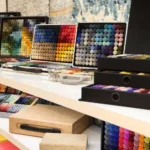
At ARS Colors, we’ve always believed that color isn’t decoration, it’s communication. As a color reference tool created to minimize dyeing errors, our work lives in the details most people never see but always feel. When designers, weavers, and manufacturers sit down with an ARS shade card or open a box of colors, they’re not just choosing tones they’re deciding how a space will breathe.
Precision in Color Matching
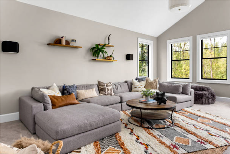
Modern homes today are leaning into palettes that soothe rather than stimulate. There’s a reason these interiors photograph so beautifully yet feel even better to live in. Soft taupe’s, chalky olives, muted clays, and diluted charcoals are replacing stark blacks and icy whites. These are colors that know how to stay. they don’t tire you out. They age gracefully. They feel winter-ready without leaning festive, luxe without trying too hard.
The charm lies in how these shades work together. A gentle camel wall paired with mushroom-toned upholstery. A barely-there blue grounding a living room without cooling it down. This is where color match becomes everything. One shade slightly off, and the magic dissolves. That’s precisely where ARS products come in ensuring that what’s imagined is exactly what’s produced, whether it’s for a rug, a textile, or a full-blown interior concept.
What’s especially interesting is how this softness is flirting with nostalgia. We’re seeing a rise in modern retro color trends but reinterpreted through a contemporary lens. Think ‘70s warmth without the heaviness. Burnt sienna mellowed into cinnamon. Avocado softened into sage. Mustard refined into antique gold. It’s retro, but polished, perfect for modern homes that want character without chaos.
Rugs, of course, play a starring role and designers are gravitating toward nuanced wool colors that anchor a space quietly. A rug in washed terracotta or foggy greige doesn’t dominate. it elevates. Wool, with its natural depth and ability to hold complex dye, becomes the perfect canvas for these layered tones. Every wool color carries subtle variations, and that’s where the richness lies. Flat color feels passé; depth is the new luxury.
And let’s talk about winter and not the obvious reds and greens, but the chic, runaway version of it. Soft mocha, cashmere grey, antique ivory, and the kind of blue that feels like dusk rather than daylight. These palettes make homes feel cocooned without being closed off. They photograph like a dream, but more importantly, they feel indulgent on a quiet evening in.
The soft power shift
At ARS Colors, our ARS collection is built for exactly this moment in design. Not trend-chasing, but trend-aware. The kind of shades that designers return to season after season because they work across materials, across geographies, across tastes. Whether someone is working with textiles, rugs, or interiors, the reliability of our color reference system allows creativity to flow freely. When color is handled with precision, design becomes effortless.
There’s also a certain confidence in choosing softer palettes today. It signals maturity in design sensibility. A willingness to let texture, light, and form do the talking. These interiors don’t rely on excess; they rely on balance. Sculptural sofa in a pale oat hue. Drapes that melt into the walls. Floors grounded by rugs that whisper rather than shout. This is where the ARS brand feels most at home, behind the scenes, making sure that whisper is perfectly pitched. Because when colors are this subtle, accuracy matters even more. A fraction off, and soft becomes dull. Warm becomes muddy. Precision isn’t optional; it’s everything.
Modern homes are no longer about proving a point. They’re about creating a feeling. Softer palettes allow spaces to evolve, to layer stories, to welcome change. And as this design direction continues to unfold, we’re proud to be part of the process, quietly ensuring that every shade, every yarn, every idea arrives exactly as intended because when color is right, everything else falls beautifully into place.