Login / Register
Login
New Customer? Start Here
Home » Signed in colors: What your home’s palette says about you
Signature Home Color Palette are homes where you walk into a room before you do. They have presence. Not loud, not trying too hard, just quietly magnetic. You don’t always know why you feel at ease or intrigued or slightly obsessed, but nine times out of ten, it’s the color doing the talking. Not the obvious kind. Not the safe beige everyone agrees on. The real kind. The shade that lingers in your memory long after you’ve left, like a good outfit or a better conversation.
At ARS Colors, we’ve spent decades decoding this unspoken language. We work with color the way editors work with words. Every tone has meaning. Every undertone carries intent. And when chosen well, color doesn’t just decorate your home, it gives you a signature home color palette look.
So, if your home had a personality, what would it be saying?
READ MORE: Sunlit Sepias & Liquid Golds: Earth tones making a luxe comeback
Some people collect art. Others collect experiences. And then there are those who collect feelings. Your home, whether you realize it or not, already belongs to one of these categories. The trick is choosing a palette that aligns with who you actually are, not who a trend report says you should be.
If you are drawn to intimacy, ritual, and a sense of grounding, you probably gravitate toward warm colors without even trying. Think spiced terracotta, sun aged ochre, burnished golds that glow softly rather than shout. These are the shades of long dinners, low lighting, and spaces that feel lived in. When layered correctly, they create some of the most timeless interior color schemes, especially when paired with natural textures and tactile finishes.
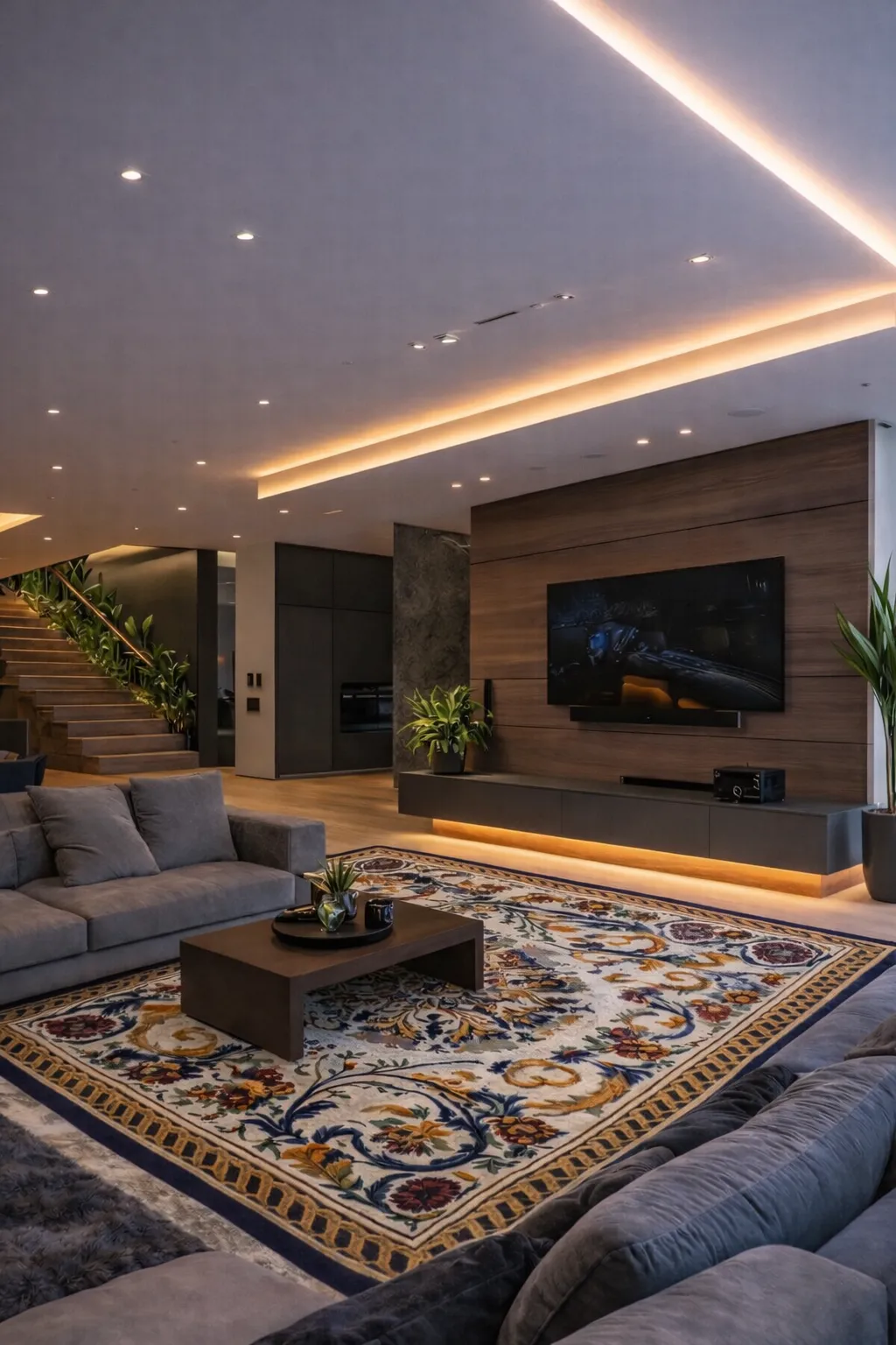
Then there’s the confident minimalist. The one who edits ruthlessly but never feels cold. This personality leans toward deep charcoals, inky blues, softened blacks, and mineral greys. These hues have weight. They anchor a space and allow form, furniture, and light to do the flirting. In our work at ARS Colors, these palettes are often the most technically demanding. Precision matters here. One wrong undertone and the room shift from intentional to flat. This is exactly where accurate color referencing becomes essential, especially when translating design intent across materials.
If your energy is playful, expressive, and a little unpredictable, neutrals alone will never satisfy you. You crave contrast. A pop color combination that feels unexpected but strangely perfect. Soft plaster walls interrupted by lacquered emerald. Muted taupe meeting electric saffron in a detail moment. These homes feel personal because they are. They don’t follow rules, they curate instincts.
And for those who are quietly romantic, drawn to nostalgia but rooted in the present, there are dusty roses, faded olives, antique blues, and whisper soft lavenders. These shades don’t announce themselves. They unfold. They are often mistaken for being safe, but when used thoughtfully, they are anything but.
The question of the best color for your house is rarely about light or size alone. It’s about temperament. Mood. How you want to feel at the end of the day when the door closes behind you.
Luxury is not about excess. It’s about control. And nowhere is that more evident than in color.
A truly luxe home rarely uses too many shades. Instead, it commits deeply to a few and explores them fully. This is where understanding tone, saturation, and consistency becomes non-negotiable. At ARS Colors, we work as a color referencing tool to minimize dyeing errors, ensuring that what a designer imagines are exactly what gets produced, whether it’s on a rug, textile, or architectural surface.
One of the easiest ways to elevate a space is to stay within a tight palette but vary the intensity. A single-color family used across walls, soft furnishings, and floor coverings creates cohesion that feels intentional. This approach is common across high end international interiors and has become a defining feature of global color stories that travel well across cultures and climates.
Another understated trick is embracing contrast, but with discipline. High gloss against matte, dense color against airiness or a dark grounding base paired with lighter, almost translucent accents. These choices signal confidence. They show that the space knows exactly what it’s doing.
And then there’s the power of accuracy. A color that looks perfect on a screen but shifts in real life can undo an entire room. That’s why serious designers rely on tools like ARS Colors to maintain consistency from concept to execution. When color behaves as intended, the result is seamless, effortless, expensive without trying.
Ultimately, your home’s signature color is not about impressing anyone else. It’s about resonance. When the palette feels aligned, the space settles. It starts to breathe. And you feel it immediately. We at, ARS Colors believe that color is more than simply a finishing touch, it is the foundation of atmosphere. Choose it with intention, follow your instincts, and let your house speak in a color that is uniquely you.
RECENT POSTS
OUR INSTAGRAM