Palette first, rug second How interior stylists use ARS to anchor a room
Home » Palette first, rug second How interior stylists use ARS to anchor a room
Beige is not a personality, and white walls can only take you so far. Somewhere between the rise of sculptural furniture and the fall of fast décor, a quiet design revolution happened —led not by shapes or silhouettes, but by shade. Soft rose, tarnished gold, stormy teal, bone, ink, jade—tones that whisper rather than shout, yet command the entire room. And make no mistake, the new class of interior stylists is starting every design not with a layout, not with a sofa, but with a palette. More specifically—with ARS Colors. Because before there’s a rug underfoot, there’s a pom in hand.
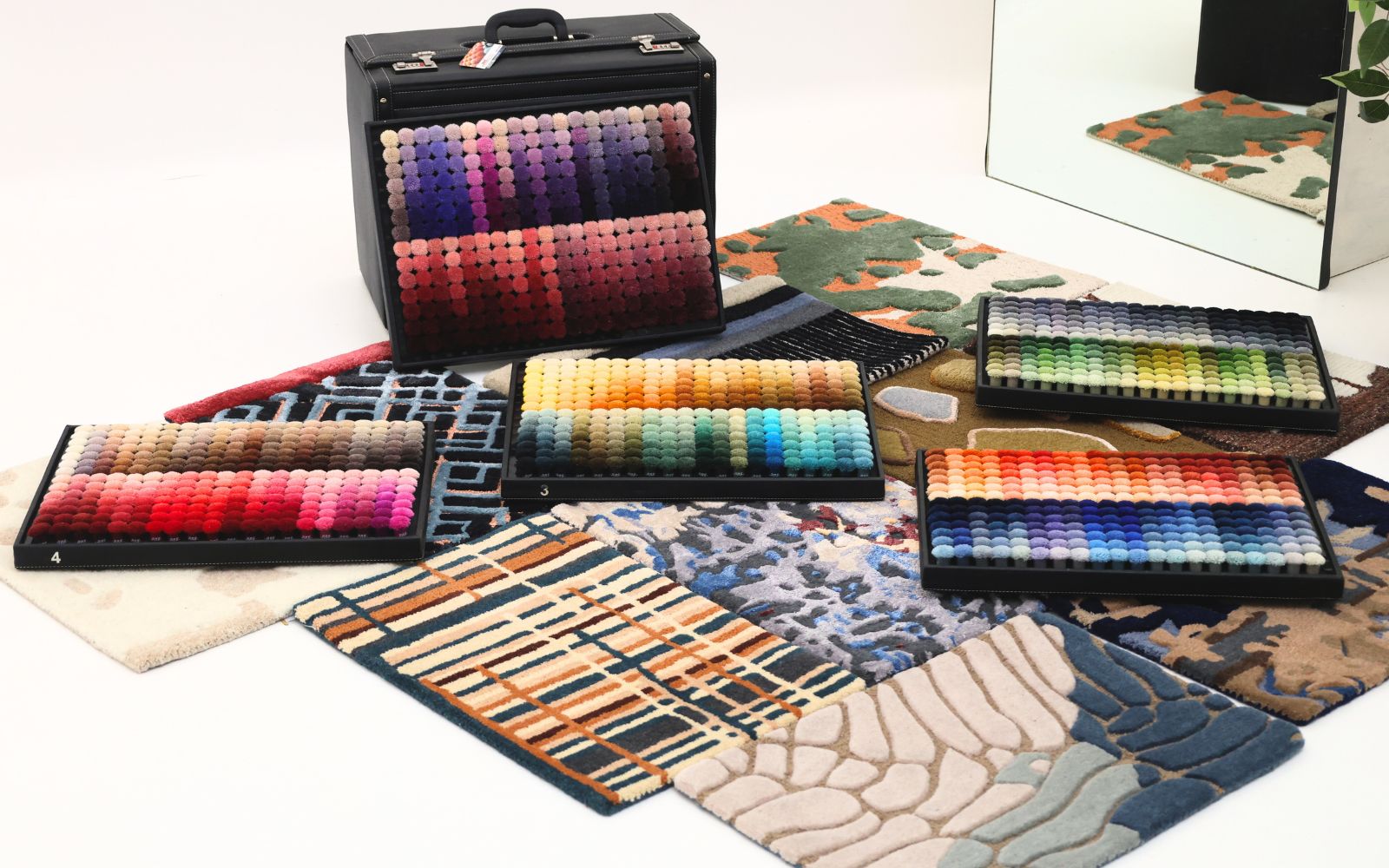
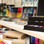
We’ve all seen it—those perfect rooms where everything just works. The exact ochre that echoes in a velvet throw, the way a rug blushes into a boucle armchair, the subtle tension of taupe and charcoal playing off each other like jazz. This is no happy accident. This is palette-forward styling, and it’s where ARS Colors comes in. At its heart, ARS Colors is a color referencing tool used to minimise dyeing errors— but to stylists and designers, it’s a kind of color bible. Think of it as the swatch book that launched a thousand interiors. With over 6,551 curated shades (and counting), we help define not just rugs, but the mood of an entire space.
Here’s how it happens. A designer walks into a project with a vibe in mind—say, quiet luxury meets Moroccan daydream. Instead of diving into furniture catalogues or paint chips, they reach for our ARS Colors pom box. Tactile, saturated, and wildly specific, our poms aren’t just samples—they’re starting points. It’s like working with a couture palette, only instead of choosing fabric for a gown, you’re dressing a room.
Once the tones are locked, the rug—often the biggest canvas in the room—gets tailored to that vision. Whether it’s a custom silk blend in dusty celadon or a wool base that echoes burnt terracotta, designers use ARS Colors to ensure every fiber is on-brand, on-tone, and totally on point. The rug doesn’t just match the room—it holds it together like a good plot twist.
And here’s the real flex: consistency. With ARS Colors, what you choose is what you get. That dreamy sea-glass green? It doesn’t mysteriously turn mint. The moody espresso? It doesn’t lean too warm in natural light. Because while creativity should be wild, color matching shouldn’t be.
It’s no wonder our poms are popping up on vision boards from Paris to Pune, in the studios of boutique design firms and the Pinterest feeds of rising interiors stars. We’ve become the go-to reference not just for rug makers, but for anyone who understands that a space is only as good as its undertones.
The truth is, color sets the tempo. It dictates the accents, guides the materials, and gives the final stamp of “yes, this is theroom.” Stylists know it. Collectors know it. Even the most minimal homes rely on a well-anchored tone to avoid looking like a rental. At ARS Colors, we don’t just supply color—we engineer cohesion. We take the guesswork out of matching, the drama out of dyeing, and the chaos out of customization. Because we believe a rug shouldn’t be an afterthought. It should be the beginning of the story.
So the next time someone says “let’s start with the furniture,” hand them a pom and smile. The best rooms don’t begin with a plan. They begin with a palette.
And we’re here for it. ARS Colors—because nothing anchors a room like the perfect shade.