Login / Register
Login
New Customer? Start Here
Home » Monochrome Magic: Decorating with Tone-on-Tone Rug Palettes
There’s something oddly satisfying about a room dressed in variations of a single hue. It doesn’t shout. It doesn’t plead for attention. It just exists—softly powerful, utterly chic, and surprisingly dramatic. Think beige on bone, smoke layered with slate, or every delicious nuance between dove and charcoal. Tone-on-tone is a more about easy symphony that color explosions; it’s like whisper luxury through shape, texture, and yes, color match skill. And when it comes to getting that classy, smooth monochromatic look? That’s where we at ARS Colors come in.
Let’s be honest—decorating with rugs can be overwhelming, especially if you’ve ever stood in a carpet store and wondered what color is wool anyway? There’s no shame in being seduced by a kaleidoscope of patterns, but there’s also nothing quite like walking into a room where a wool color story flows uninterrupted from wall to wall. It’s elevated minimalism. It’s monochrome magic. And if you know how to layer the right tones, it’s effortless impact.
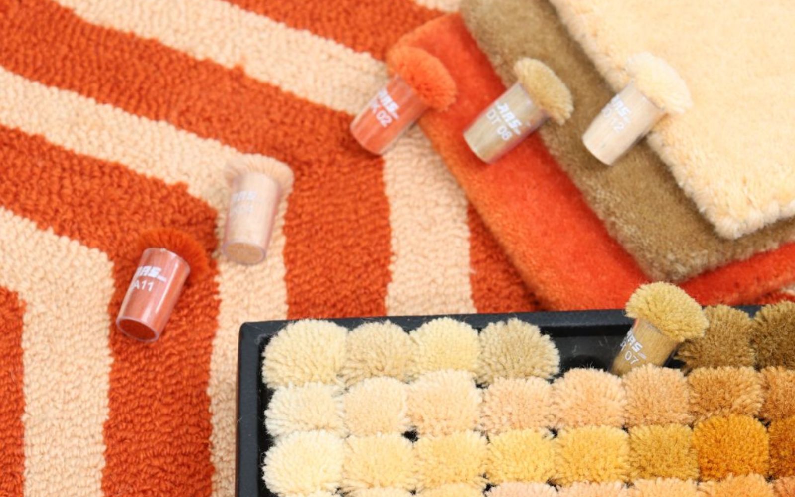
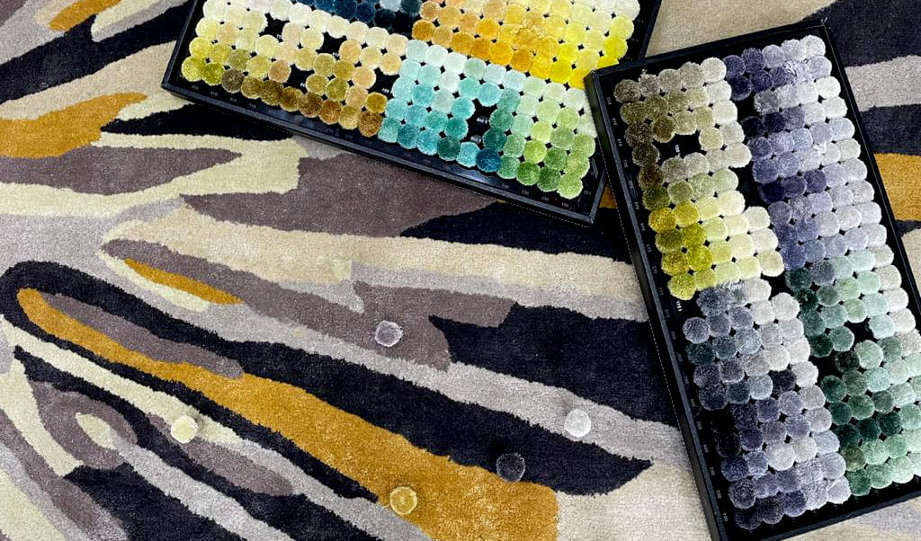
At ARS Colors, we’re fluent in the language of wool colors and tonal nuance. Our box of colors isn’t just pretty to look at, it’s a working tool, designed to ensure flawless color reference and eliminate dyeing guesswork altogether. So when you’re searching for that exact shade between oatmeal and mushroom, our ARS products—especially the ARS Pro Concreta palette—are your new best friends.
Now let’s talk mood. Tone-on-tone rugs are beautiful because they may emotionally shape a room. Perfect for a gallery-like living room or a tranquil bedroom retreat, cool taupes and cold greys speak in soft, carefully chosen whispers. Intimacy is promoted by warmer hues like camel or sandy blush, which ground your home while allowing it to breathe.
The trick? Play with pile heights, materials, and finishes. A matte ARS wool flatweave layered beneath a shimmery silk-cut pile? Chef’s kiss.
And don’t be fooled—monochrome doesn’t mean monotone. The real fun is in the mixing. Pair plush with patterned, matte with shine, or tonal stripes with geometric embossing.It inside the same color palette, not outside of it, is crucial. Tone-on-tone rugs are the ideal neutral canvas because they pack your space in texture, support your standout pieces, and allow your style to shine through without becoming overpowering.
Need inspiration? Peek into the curated world of Arsin Rug Gallery, where quiet color stories are elevated to couture-level artistry. Or browse the ARS collection, where every rug begins with a scientifically precise color reference—no surprises, no near-misses, just the hue you imagined, matched to perfection. That’s the kind of creative control designers dream of. That’s the ARS brand difference.

And let’s be real—modern retro color trends aren’t going anywhere. We’re seeing a huge wave of interior designers embracing burnt ambers, chalky mints, and greige-on-beige combinations. The beauty of tone-on-tone in this context? It lets you play with these nostalgic hues in a way that feels entirely now. A dusty teal wool rug under a velvet citron couch? Unexpected, but trust—it works. Especially when the color match is flawless, which, spoiler alert, it will be.
At ARS Colors, we don’t just talk about tone—we engineer it. We assist stylists, designers, and rug fans in creating unique stories that thrive in the spaces between, using every shade in our toolbox (pun intended). Because decorating is about going deeper rather than louder. Also, the quietest spaces may have the most striking effects.
So go ahead—embrace the monochrome. Dive into those thirty shades of slate, fall in love with faded rose, and don’t fear the off-white spectrum. With ARS Colors as your guide, you’ll never miss the mark. Because great design doesn’t come from bold choices—it comes from bold precision. And yes, it all begins with the right color reference.
RECENT POSTS
OUR INSTAGRAM