Luxurious Earth Tones Design are particular kind of magic when a room glows. A quiet warmth slips into the edges of a space. Suddenly everything feels softer, richer, and a little more cinematic.
Lately, that glow has a color story of its own: shades that hum like mellow saxophone notes: hues that look drizzled, poured, kissed by late-afternoon light. Call them sunlit sepias, call them liquid golds, call them the golden-hour filter of your dreams, what matters are this: earth tones are back, and they’ve never looked this unapologetically luxurious.
At ARS Colors, we’ve watched palettes evolve, cycle, reinvent themselves, but this return? This feels less like a trend and more like a homecoming. Earth tones are stepping back into the spotlight with the swagger of old Hollywood lighting: warm, moody, impossibly flattering. And designers around the world are chasing that same warmth with a renewed appetite, selecting shades that look as though they’ve been steeped slowly, like tea swirling in antique porcelain.
The Golden-Hour aesthetic returns
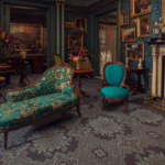
The reason is simple: luxury is leaning back into comfort. Not the fuzzy-sock kind, the quiet decadence kind. The kind of comfort that pairs beautifully with marble, brass, silk, walnut, and hand-woven textiles. The kind of comfort that doesn’t whisper; it purrs. And the tones carrying that feeling those slow, molten browns and honeyed golds are right at the heart of our ARS collection this season.
One of the joys of working with earth tones is their versatility. They shape-shift beautifully, grounding minimalist spaces while adding depth to maximalist ones. Designers are calling this revival part of the modern retro color trends wave, a warm pivot from icy neutrals and grayscale palettes that dominated the last decade. Suddenly, beige isn’t beige anymore, its almond mousse, or latte foam, or sun-steeped parchment. Brown isn’t brown; it’s roasted barley, vintage leather, or burnished bronze. Gold isn’t gold; it’s whisper-soft champagne or the melted warmth of amber soaked in sunlight.
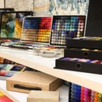
And yes, we’ve matched every single one of these hues to perfection because at ARS Colors, color precision isn’t a flex; it’s our language. When a designer needs the exact warmth of vintage cognac leather or the buttery gold of a late-summer field, our color reference tools ensure that what they imagine is exactly what lands in the dye bath. No surprises. No misfires. Just an effortless color match calibrated down to the whisper of a tone.
This is why our studio is buzzing with requests for sepias, ochres, terracottas, and honey gold hues. A box of warmth. A box of colors that feels like a curated cabinet of sunlight. And the reinvention of warm tones is just beginning.
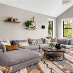
Sunlit sepias, for instance, have become the new anchors of winter decor. They make spaces feel enveloping but never heavy. Think velvety browns that feel like sinking into a leather-bound novel. Think sepias that blur the line between heritage and contemporary cool. Paired with brushed brass or smoked glass, the effect is irresistibly sophisticated, almost cinematic.
Drizzled, dipped, and deliciously luxe
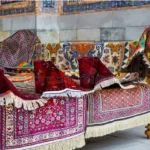
Then there are the liquid goldstones that bring radiance without the glitter, glow without the glare. These shades sit beautifully in everything from wool colors for rugs to accent paints and textile trims. Our clients in interiors, fashion, and rug design are dipping deep into this palette, weaving molten honey hues into luxury carpets, upholstery, and statement walls. It’s a palette that doesn’t try too hard yet transforms everything it touches.
One of our favorite transformations this season has been watching designers at Arsin Rug Gallery lean into these shades, crafting rugs that feel like floor-level sunsets. Whether rendered in wool color poms or silk blends, these tones melt into each other in ways that feel instinctive, elegant, and irresistibly touchable.
ARS Colors: Perfecting every shade of glow
This is where we come in, not as tools, but as touchpoints for the creative process. Whenever a designer needs clarity, consistency, or confidence with their color pallet, our swatches and poms step in to guide the eye and the hand. Earth tones may be warm and emotional, but achieving that warmth demands technical precision, and this is where the ARS brand continues to shine.
What we’re witnessing now is a bold shift toward warmth that isn’t rustic but refined, not earthy in the rugged sense, but earthy in the most opulent way possible. These tones feel lived-in, not old; rich, not loud; curated, not cliché. They look especially striking in winter interiors, bringing subtle radiance to stone, wood, and textile-heavy rooms.
So, if you’re ready to reimagine your spaces, start with warmth. Start with depth. Start with shades that glow from within. Curate a wall in toasted almond, drape a sofa in muted marigold, lay down a rug woven in tobacco and gold threads that shimmer under soft lamps. Invite in colors that look like they’ve been aged in sunlight.
Because this season, Luxurious Earth Tones Design has a new love story. And it’s written in sepias, kissed by gold, and perfected, down to the final tone by ARS Colors.