Login / Register
Login
New Customer? Start Here
Home » The Instagram aesthetic 2026’s most saved home color stories
Interior Design Color Trends are some homes stay with you, not because they’re overdone or dramatic, but because everything feels quietly in sync. The tones, the textures, the way the light moves across a room, and picks up exactly what it should. You scroll past, pause, go back again. It’s subtle, but it works. And more often than not, the difference isn’t décor, it’s color done right.
At ARS Colors, we’ve always known that a space doesn’t come together by chance. It’s about choosing shades that don’t just look good individually, but belong together. The kind of precision most people don’t notice immediately, but always feel. And if 2026’s most photographed homes are telling us anything, it’s this: the palette is doing all the talking.
This year, monochrome color palettes are having a moment, but not in the way you’d expect. It’s less stark black and white, more tonal layering that feels soft, considered, and incredibly elevated. Imagine a room washed in warm taupe, where the rug, the walls, and the upholstery all sit within the same family, but each brings a slightly different depth.
What makes it interesting is the detail. A matte wall against a silk-blend rug. A linen sofa paired with something a little more tactile underfoot. Nothing clashes, nothing competes, but nothing disappears either.
The tricky part is getting the tones exactly right. One shade leaning too pink or too dull can throw everything off. That’s usually where things fall apart. This is exactly where ARS Colors comes in. As a color referencing system designed to minimise dyeing errors, we make sure the shade you choose is the shade you get. No second-guessing, no surprises. Just a seamless flow from idea to execution.
We’re also seeing monochrome move beyond the usual neutrals. Soft olive rooms, powdery blues, even muted clay tones that feel sunlit rather than heavy. The idea is to keep everything cohesive, not flat. Let the palette build gently instead of shouting for attention. If you’re trying to bring this into your own space, start with one anchor. A rug works beautifully here. Build around it, layer by layer, using ARS Colors to keep every element aligned. It’s less about adding more, more about refining what’s already there.
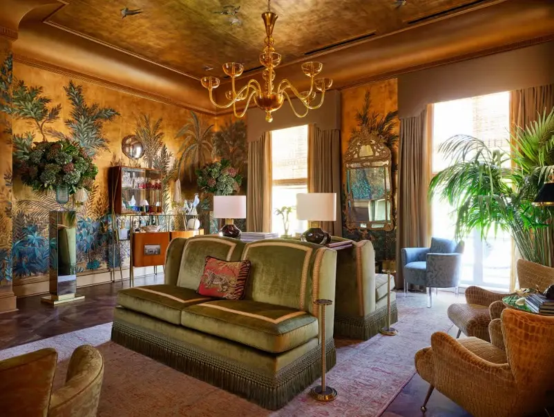
Alongside these tonal spaces, another story is unfolding. Homes that feel like they’ve gathered pieces over time. Not styled to perfection, but edited with intention. This is where global colors step in, bringing warmth, depth, and just enough contrast to keep things interesting. Deep indigos, aged terracottas, those slightly dusty reds that don’t feel new, but feel right. They carry a sense of history without overwhelming the space. And when used well, they add character in a way that feels effortless.
The most striking homes right now are blending these influences into layered interior color schemes. A richly toned rug in an otherwise minimal room. A hint of something bold, balanced by everything around it. Nothing feels out of place, even when it technically should, but again, it all comes down to accuracy. These shades are nuanced. A little too bright, and they lose their charm. Too muted, and they fall flat. At ARS Colors, we focus on capturing these in-between tones with precision. Whether it’s matching a reference from a vintage textile or developing a completely new shade, the goal is always the same: consistency that feels natural.
If you’re leaning into this look, think of it as collecting rather than decorating. Choose pieces that feel personal, then let the colors tie them together. A strong base, a few standout moments, and everything else supporting quietly in the background because the homes everyone is saving right now aren’t trying to impress. They feel easy, lived-in, and complete in a way that’s hard to explain but easy to recognise, and that’s really what we do at ARS Colors. We make sure your palette holds together, exactly the way you imagined it would. No approximations, no near matches. Just the right shade, in the right place, doing exactly what it’s meant to, sometimes, that’s all it takes.
RECENT POSTS
OUR INSTAGRAM