Avoiding Carpet Design Mistakes: A Guide to Color Matching and Precision
Home » Avoiding Carpet Design Mistakes: A Guide to Color Matching and Precision
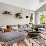
Designing a carpet is a lot like putting together the perfect outfit. You can have the best cut and the finest fabric, but if the colors clash, the whole look falls flat. The same goes for interiors. Even a stunning pattern or a luxurious weave can feel off if the colors don’t work harmoniously within the space.
One of the most common carpet design mistakes is underestimating just how powerful color really is. That’s where carpet color matching comes in. At ARS COLORS, we’ve seen how designers and manufacturers completely elevate their projects when they stop guessing and start working with precision. Let’s look at the biggest color challenges in the carpet design process and how to avoid them.
When Carpet Colors Don’t Turn Out as Expected
Ever picked what you thought was a soft cream carpet, only to see it turn yellow once it’s in the room? Or chosen a grey that suddenly looks a little too brown under natural light? Even small shifts in shade can completely change the feel of a space.
The solution is simple: stop relying on memory or vague color names. With ARS COLORS, every shade has a universal number, so the color you select is exactly what the manufacturer produces: no surprises, no letdowns.
Making Carpet Color Choices That Work Every Time
Picking carpet colors can be tricky. Too many shades? The design feels chaotic. Too few? It feels flat. The secret is to balance mixing calming neutrals with a few bold accents.
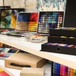
With ARS COLORS’ wool pom box, you don’t have to guess. Hundreds of shades in your hands let you see how colors really work together—like a mood board you can touch. It makes picking the perfect palette simple, fun, and stress free.
The Pressure of Luxury Carpet Colors
When clients are paying for luxury carpets, the color should be exactly not close enough. Imagine you have promised a deep emerald carpet to a client, only for it to arrive looking more like forest green. That’s where the problem begins. With luxury carpet even the smallest change can be disaster.
To fix this issue? With ARS COLORS pom as your guide, every carpet is dyed to match your exact vision. From private villas to five-star hotels you’ll get the precise shade you approved flawless and consistent.
Avoid Miscommunication in the Carpet Design Process
One of the biggest challenges in carpet production is making sure the color you imagine is the color that gets produced. Descriptions like sand taupe or moss green leave too much room for interpretation and what you get back from the manufacturer can be a completely different shade.
With ARS COLORS, you don’t have to guess. Every shade has a unique number on it so your manufacturer team will know the exact shade you are choosing. That means fewer surprises, faster approvals, and carpets can turn out exactly the way you wanted it to be.
Why Custom Pom Boxes Change the Way You Design
Every project has its own personality, and so does every designer. A custom pom box lets you handpick the shades that fit your style, your clients, or even your brand identity. Instead of flipping through hundreds of colors you’ll never use, you’ve got your personal palette ready to go. The result? Faster decisions, consistent results, and a “signature toolkit” that makes your design process feel effortless.
Final Word: Color Is the Detail That Changes Everything
The carpet design process isn’t just about patterns, textures, or weaves—it’s about getting the colors right. Avoiding common carpet design mistakes comes down to precision. With the right tools—like a wool pom box, standardized shade system, or a custom pom box—you can move confidently from concept to finished carpet without the stress of mismatched results.
ARS COLORS – helping designers get color right, every single time.