Login / Register
Login
New Customer? Start Here
Home » The Rug-Led Interior: Where color finds its ground
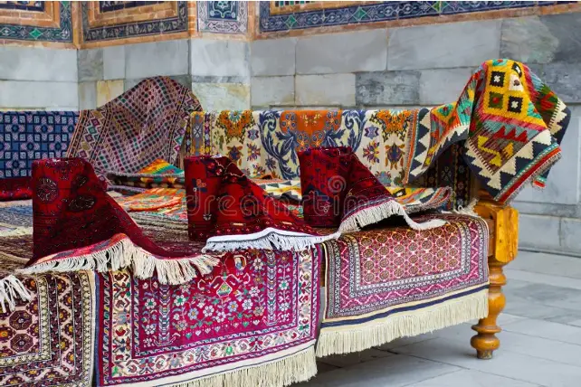
Rug-Led Interior Design is a quiet rebellion happening in interiors right now and it’s happening underfoot. Walls, once the unquestioned heroes of dramatic design moments, are stepping aside. The spotlight has shifted. Floors are speaking louder, richer, and far more stylishly than ever before. The rug once polite, supportive, almost background is now the main character. And frankly, it’s thriving in the role.
At ARS Colors, we’ve been watching this shift unfold with a knowing smile. Because when a rug becomes the new accent wall, color suddenly matters in a way that’s deeply intentional, slightly daring, and undeniably chic. This isn’t about throwing down something decorative. This is about anchoring a room with confidence, choosing hues that hold a space together while still letting it breathe.
What makes rugs the moment? For starters, they don’t shout. They don’t glare at you from eye level. Instead, they ground the room, carrying mood and movement in a way that feels instinctive. A rug can warm a minimalist living room, sharpen a soft bedroom, or add a wink of drama to an otherwise composed space. It’s visual storytelling but whispered, not announced.
The real magic happens when color enters the conversation. We’re seeing a delicious return to depth with tones that feel lived-in, layered, and slightly nostalgic without veering into costume. Think modern retro color trends reimagined for today’s homes: muted clays, inky blues, softened rusts, burnished olives. These are shades that feel tactile even before you touch them. Especially when translated into wool colors, where pigment settles into fiber with a kind of quiet luxury.
This is where our work at ARS Colors becomes personal. As a color referencing tool created to minimize dyeing errors, precision is our love language. When a designer commits to a rug-led interior design space, there’s no room for guesswork. The rug isn’t an accessory it’s the anchor. A single shift in tone can change the temperature of an entire room. That’s why color reference isn’t a technical detail for us; it’s the backbone of good design.
Right now, winter-ready rug-led interior design are leaning into palettes that feel plush without being heavy. Deep espresso browns paired with softened camel. Dusty plums against warm greige. Midnight teal layered with hints of antique gold. These combinations feel luxe, intimate, and slightly cinematic, exactly the kind of atmosphere a rug-as-accent-wall demands. Our box of colors exists for moments like this: when a designer wants to explore nuance, not noise.
One of the most common questions we hear is how to get the balance right. The answer is refreshingly simple: let the rug lead, then let everything else follow. When the floor carries the strongest visual story, walls can relax into quieter tones. Furniture feels more intentional. Even lighting starts to behave differently, responding to the richness below. Suddenly, the room feels composed rather than decorated.
This approach is also why neutral doesn’t mean boring anymore. A carefully chosen wool color like stone with a whisper of warmth, ivory with a greyed undertone can feel infinitely more elevated than a bold wall ever could. It’s subtle, confident, and the kind of choice that feels straight out of a Décor spread magazine, where nothing is trying too hard, yet everything looks perfect.
Our ARS collection is built around this idea of considered impact. Whether a rug leans graphic or softly tonal, its success depends on accurate color match, especially when it’s meant to carry the visual weight of a room. Designers working with us often say the same thing: once the rug is right, the rest falls into place.
We’re also seeing more experimentation in layered palettes. Think tonal rugs that play within a single family like five variations of sand, three moods of blue, a conversation between moss and sage. These aren’t accidental choices. They come from a deep understanding of how color behaves across texture, light, and scale. It’s the kind of exploration that starts with ARS products laid out on a table, shades compared side by side, decisions made with intention.
And yes, this moment has found its way into curated spaces, where rugs are no longer displayed as complements but as statements. Hung, layered, spotlighted. Treated less like floor coverings and more like works of art which, frankly, they are.
As an ARS brand, we believe good color should feel effortless, even when the thinking behind it is meticulous. Rugs becoming the new accent wall isn’t a trend we’re chasing; it’s a shift we understand instinctively. Because when color is right, when reference, texture, and tone align a rug doesn’t just finish a room. It defines it.
So, if walls are feeling a little predictable lately, maybe it’s time to look down. The floor has a lot to say and with the right palette, it might just be the most stylish voice in the room.
RECENT POSTS
OUR INSTAGRAM