ARS X Meets High FashionThe shades that are taking over 2025’s design scene
Cobalt crush, muted melon, and a pink so powdered it might as well be a whisper— welcome to the ARS X takeover. It’s 2025, and color isn’t just a design element anymore; it’s the main character. And here at ARS Colors, we’re not just watching the trends, we’re mixing them, naming them, referencing them, and giving them a proper seat at the table (preferably next to a mohair sofa and a dramatically oversized chandelier).
If you’ve been wondering what shade of olive actually goes with brushed brass, or debating whether mauve is still having a moment—relax. We’ve decoded it all. Our color reference systems aren’t just about finding a shade; they’re about defining a mood, anchoring a palette, and eliminating every “close enough” dye mishap in the process. Because let’s face it—color is precision, and at ARS Colors, we speak fluent color match.
2025’s color scene is giving main character energy
This year, modern retro color trends are getting a spicy, fashion-fueled twist. We’re talking elevated 70s palettes remixed with digital-age confidence. Picture: rust meets lavender, pistachio dipped in chrome, and marigold paired with midnight slate. Drama? Always. But make it calculated, curated, and utterly chic.
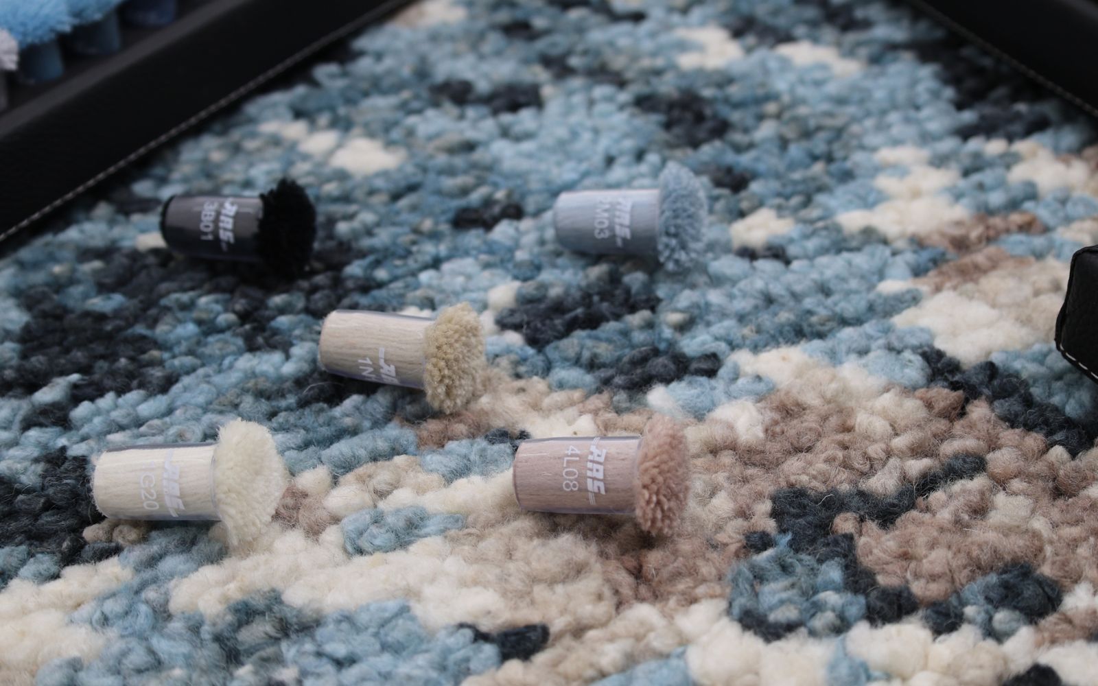
The ARS 1000 and ARS 300 collections are practically runway-ready at this point. With over 1000 colours in our box of colors, we’re not just keeping up with design trends— we’re setting the tone. Literally.
And if you’re into concrete tones with personality, meet ARS Pro Concreta—a line that brings minimalist hues into their rich, textural era. Pair it with muted wool colors or soft velvet for a design contrast that feels like a Balenciaga boot in a room full of ballet flats.
So... What color is wool in 2025?
Glad you asked. The short answer: àrs makes it exactly what it needs to be. From earthy oatmeal tones to electric lilac, our wool color range is where tradition meets runway rebellion. These aren’t your grandma’s rug shades (unless your grandma was a haute couture muse, in which case—respect).
Designers, stylists, and interior artists are leaning hard into the color pomps life. Our ARS Pomps and colorante arssystems make it easy to visualize, sample, and slay your next project—whether it’s an oversized arsin rug gallery piece or a limited-edition collab capsule for a Milanese loft.
Moodboard it like a Pro
Not sure where to start? Here’s a cheat sheet for your next moodboard moment:
Honeyed Saffron + Ice Grey: Start with a creamy ARS Paints base and layer it with soft textiles in saffron. It’s quiet luxury meets desert drama.
Petrol Teal + Dusty Blush: A match made in Parisian studio apartments. Anchor it with a color box rug and let the art speak for itself.
Slate Black + Neon Persimmon: For the bold and the fearless. This one’s for high- fashion homes and risk-taking designers. (Go on. Be the moment.)
And if you’re a serial perfectionist (no judgment), our ARS Products ensure your color pallet is consistent across textiles, walls, and even custom pieces. No more “almost” matches—just pure, intentional, chromatic clarity.
Don’t just follow color trends—Define them
At ARS Colors, we know a bold palette is more than a choice. It’s a statement. It’s confidence in a box colors. It’s the precision of 10 ARS swatches laid out in perfect harmony. It’s you, saying this is what 2025 looks like.
So, whether you’re sourcing for couture rugs, mapping out a gallery wall, or obsessing over the exact tone of your velvet headboard—come play with us. Come dive into the color-mad, editorial-coded, dye-perfect world of ARS X.