Login / Register
Login
New Customer? Start Here
Home » Sage Advice: How to incorporate the latest earthy tones into your home décor
Some shades don’t shout—they exhale. Soft moss, sun-warmed terracotta, the kind of creamy taupe that whispers calm, but make it chic. If 90s neutrals were the minimalists of their time, today’s earthy tones are their grown-up, globally-inspired cousins—effortless, elegant, and just the right amount of grounded. They’re the colors that don’t need an introduction, but still manage to steal every scene.
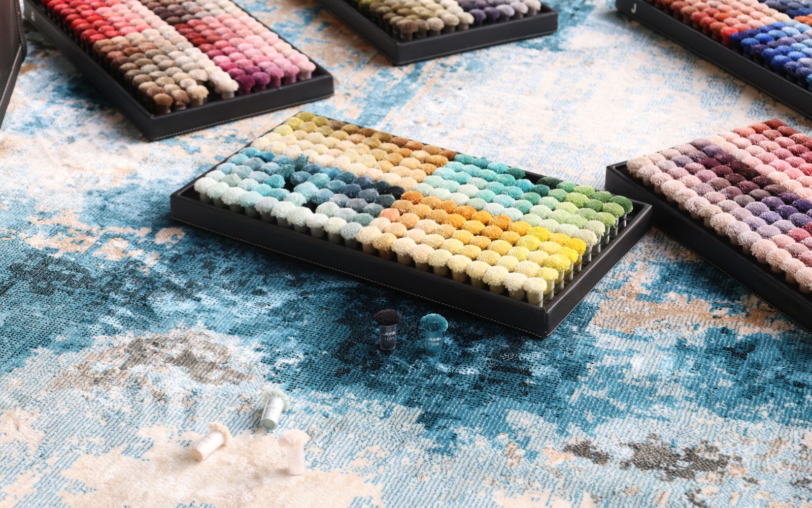
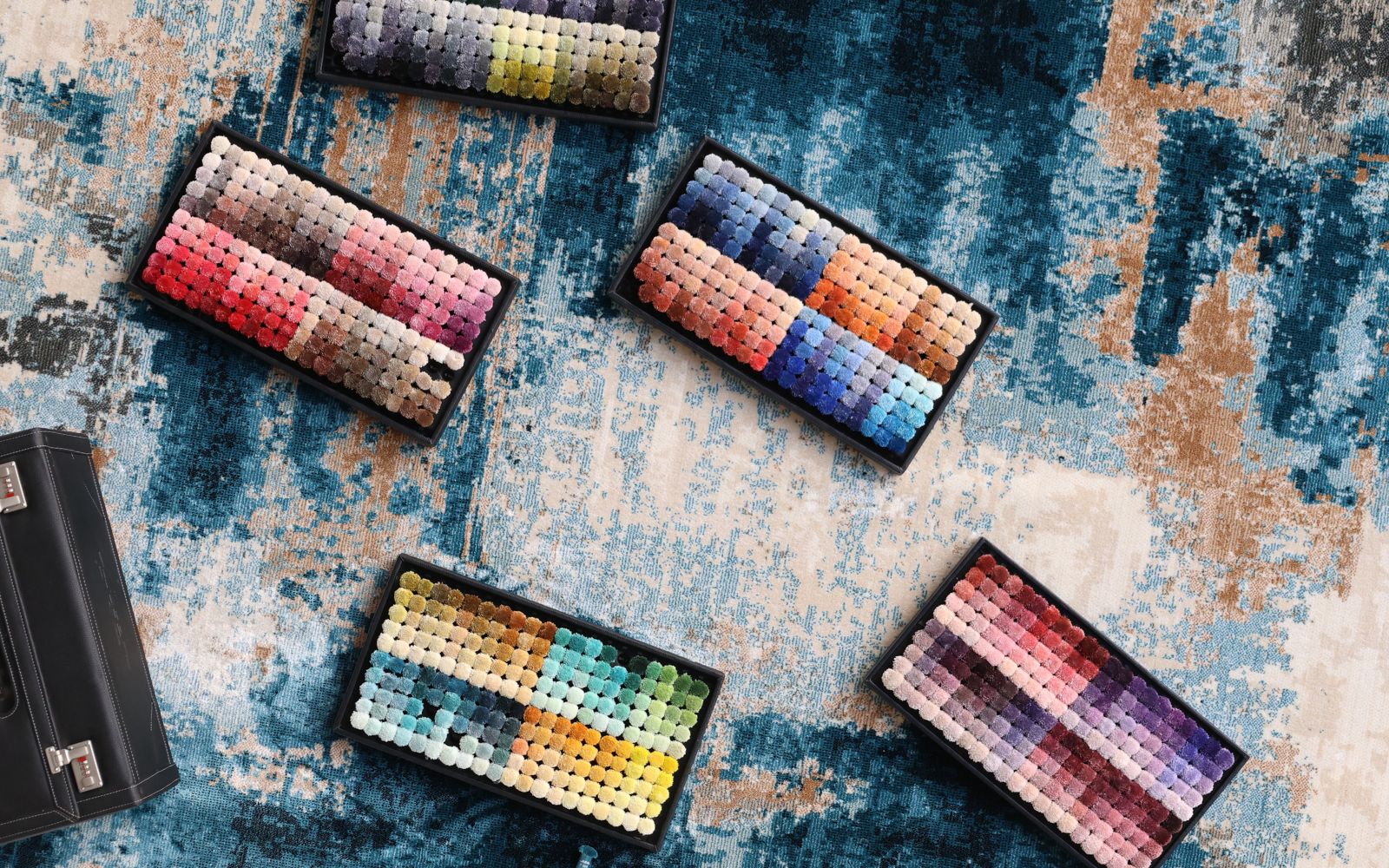
At ARS Colors, we’ve always known that choosing the right tone is less about trend-chasing and more about emotional intelligence. Yes, you heard that right—color has a vibe, and right now that vibe is organic, textural, and oh-so-sophisticated. Think sage that feels like it was plucked from a Mediterranean herb garden, sienna straight from Italian rooftops, and clay-inspired neutrals with depth and dimension. And because ARS Colors is a color referencing tool used to minimise dyeing errors, you can trust that what you fall in love with on the swatch is exactly what shows up in your final fabric, wall paint, upholstery—or wherever your design muse leads you.
But let’s break it down. How do you actually incorporate these hues without going full Tuscan villa or accidentally turning your space into a Pinterest DIY zone?
Step one: Pick your hero tone. Whether it’s a dusty olive, a buttery ochre, or a raw-edged umber, anchor your palette with one star shade. Use it with confidence—a velvet armchair, a wall painted in that exact shade pulled from your ARS Colors box, or a wool throw that brings out its best undertones. Let it live and breathe in the room.
From there, layer. ARS Colors makes that easy with an expansive palette of tones that speak the same visual language. Earthy tones love each other. A burnt almond shade sits beautifully next to weathered charcoal. Soft terracotta finds balance with eucalyptus green. These aren’t opposites; they’re siblings. And the beauty of using ARS Colors? You can explore dozens of nuanced matches—not just green, but the right green. Not just beige, but that soulful beige with a blushy undertone that makes your lighting look expensive.
Now, let’s talk texture. Earth tones aren’t about flat finishes—they come alive in contrast. So once you’ve selected your palette through ARS Colors, bring in natural materials: brushed brass, slubby linens, raw wood, terracotta ceramics. This isn’t a showroom- perfect vibe. It’s curated, comfortable, collected. The goal? A space that feels lived-in, but still looks like it belongs in a coffee table book.
And while we love a clean aesthetic, don’t be afraid to surprise yourself. Throw in an earthy chartreuse, or a moody, olive-toned grey as an accent. With ARS Colors guiding the way, your palette remains tight—even when you’re experimenting. That’s because ARS Colors is a color referencing tool used to minimise dyeing errors, and the accuracy it provides is second to none. You get consistency across textiles, materials, and applications. No color confusion. No tonal meltdowns.
Pro tip: Earth tones pair stunningly with soft lighting. Dimmer switches, warm LEDs, and natural light all enhance their appeal. Think how that clay-toned wall warms up during golden hour. It’s the interior design equivalent of perfect cheekbone lighting.
So whether you’re redecorating a powder room, refreshing a reading nook, or curating your entire home to feel like a desert-luxe escape, remember this: earthy doesn’t mean bland. It means bold—just in a very, very refined way. And with ARS Colors as your behind-the-scenes guide, your color choices don’t just speak—they serenade.
Go ahead, get grounded. But make it fashion.
RECENT POSTS
OUR INSTAGRAM