Login / Register
Login
New Customer? Start Here
Home » 2025 ARS Color trends for rugs and interiors What’s Hot Now

There’s a certain shade of green this year—equal parts absinthe, envy, and late-summer fig—that’s showing up everywhere from five-star hotel lobbies to moody hallway runners. It doesn’t ask for permission. It just exists—bold, chic, and slightly unexpected. That’s the magic of color in 2025: unpredictable, unapologetic, and completely in control. At ARS Colors, we’ve seen palettes go from paint chips to power moves, and this year’s trends? They’re anything but shy.
As a color referencing tool used to minimise dyeing errors, we don’t just follow color movements—we forecast them. Our team works with the world’s most discerning designers, artisans, and tastemakers, decoding not just what’s trending, but why it’s trending. The result? A hue-driven cheat sheet for the interiors of now—and next.
2025 is not about playing it safe. It’s about choosing tones that feel. Think saturated
paprika that hugs the room like a cashmere wrap. Buttercream neutrals that glow under
soft lighting. Terracotta that leans a little more fashion editorial than farmhouse. The shift is clear: color is no longer a background act—it’s the whole show.
At ARS Colors, we’re seeing a love affair with contrast—bold meets bare, opulent meets organic. Deep charcoal (not quite black, but definitely serious) is anchoring living spaces, while icy lilac sneaks into minimalist bedrooms as the new go-to neutral. That’s right. Lilac
is neutral now. Try keeping up.
Earth tones are still having their extended moment, but they’ve evolved. No more washed-out beiges or dusty olives. This year, it’s all about spice: cumin browns, turmeric golds, and an orange-rust hybrid we’ve unofficially dubbed “sunset sorbet.” These are the tones that make you want to redo your guest room, or at the very least, your throw pillows.
And for the color maximalists (we see you), jewel tones are back—but sleeker. 2025’s emerald is moodier, more cinematic. Sapphire is deeper, like a velvet rope at an invitation-only afterparty. Even ruby red has had a rethink: think lacquered, polished, a little provocative.
What’s driving this bold renaissance? Personalization. Clients want shades that feel like them—not something lifted from a Pinterest board or borrowed from a showroom floor.
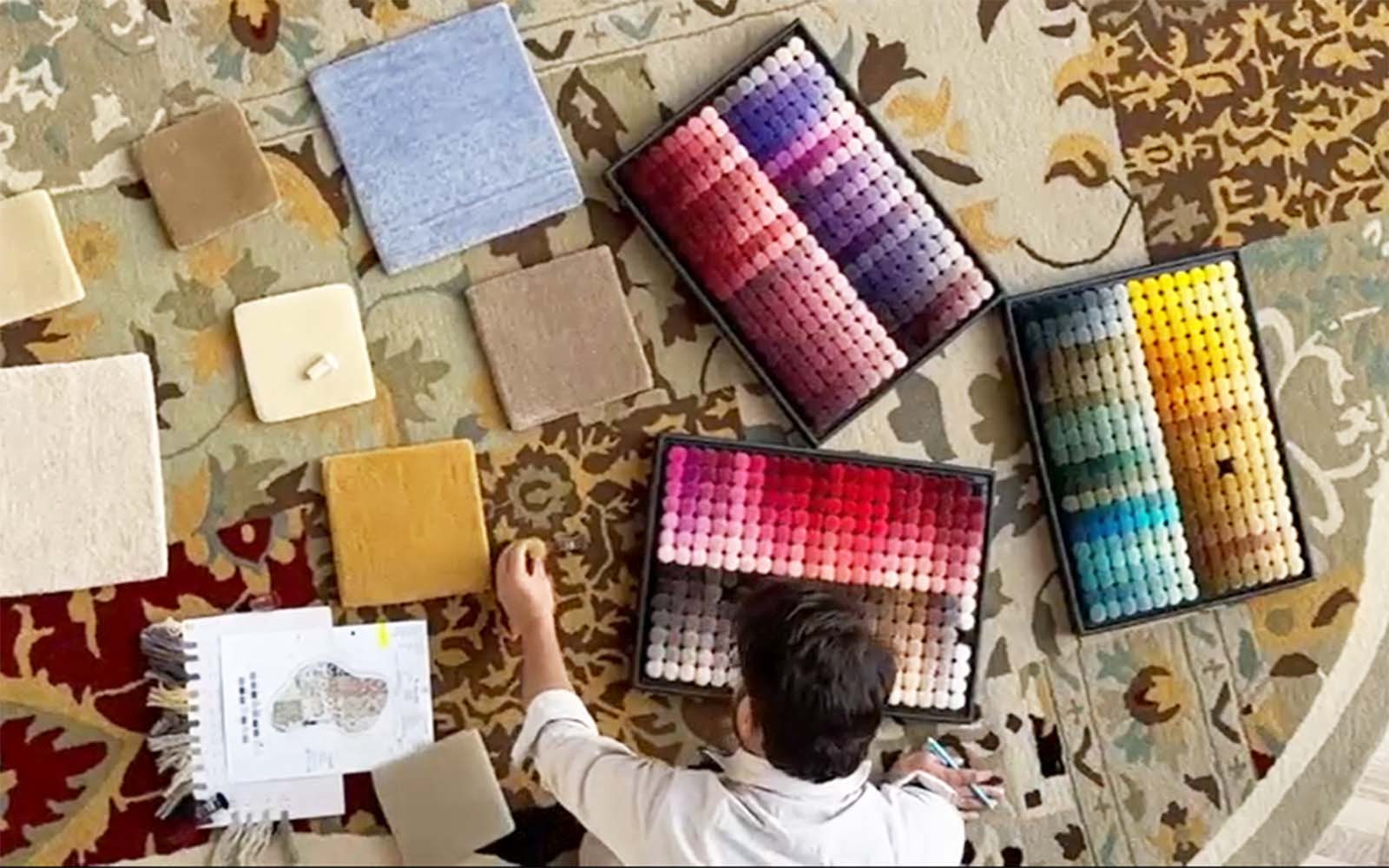
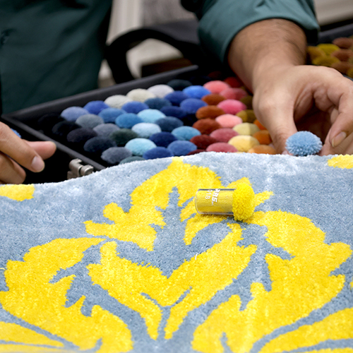
With ARS Colors, the process becomes part of the narrative. Because when you’re selecting from our curated poms and swatches, you’re not just picking a tone—you’re setting the vibe.

Let’s not forget texture. Color behaves differently depending on what it’s poured into. A burnt sienna in hand-knotted wool radiates warmth; the same shade in silk? Pure seduction. That’s why precision is key. With ARS Colors, designers can translate moodboards into dyed perfection without the dreaded guesswork. It’s the difference between almost and absolutely.
This year, even the classics are getting reimagined. Black is being softened into ink, white into porcelain. Greys are moving toward lavender-tinted fogs, and navy? Navy is flirting with teal, hard. Nothing is static, and that’s exactly the point.
For interiors, rugs are leading the charge in this chromatic rebellion. A rug in the right hue can recalibrate an entire space—grounding, guiding, and glamorizing all at once. And when the color is pulled straight from an ARS Colors reference, you know it’s going to land exactly as intended. No second-guessing, no dye disasters. Just perfect, polished precision.
So, what’s hot now? It’s color with confidence. It’s shades that know their impact and aren’t afraid to make an entrance. At ARS Colors, we’re here to keep your palettes bold, your dyeing flawless, and your interiors effortlessly ahead of the curve.
Because in 2025, the vibe is this: pick a shade, make it personal, and let it live out loud.
RECENT POSTS
OUR INSTAGRAM